Quick summary:
- Bagru is a specific hand block printing tradition from a village near Jaipur, carried by the Chhipa community and recognised with GI status
- Dabu is a mud-based resist paste, not a colour, used to protect parts of the fabric during dyeing
- Fabric prep involves soaking, washing and traditional treatments before any printing begins
- Colours come from natural sources: iron, madder, indigo, harda and kashish, not synthetic dye stock
- Indigo dyeing depends on a living vat that needs ongoing care and monitoring
- A single design can require several hand-carved sheesham wood blocks, not just one
- Motifs like gainda, gulab, kamal, bel, buti and buta define the visual language of the craft
Most people who source or shop for block printed textiles have run into “Bagru print” used as a generic label, almost as a stand-in for hand block printing in general. That framing skips over what actually makes Bagru distinct: a specific place, a specific community and a process built from techniques that can’t really be rushed or shortcut. This piece walks through what’s genuinely happening at each stage of the craft, from the resist paste to the dye sources to the blocks themselves, so the label means something concrete rather than functioning as a vague marker of “handmade.”
Bagru Printing: A Deeper Look at the Craft Itself
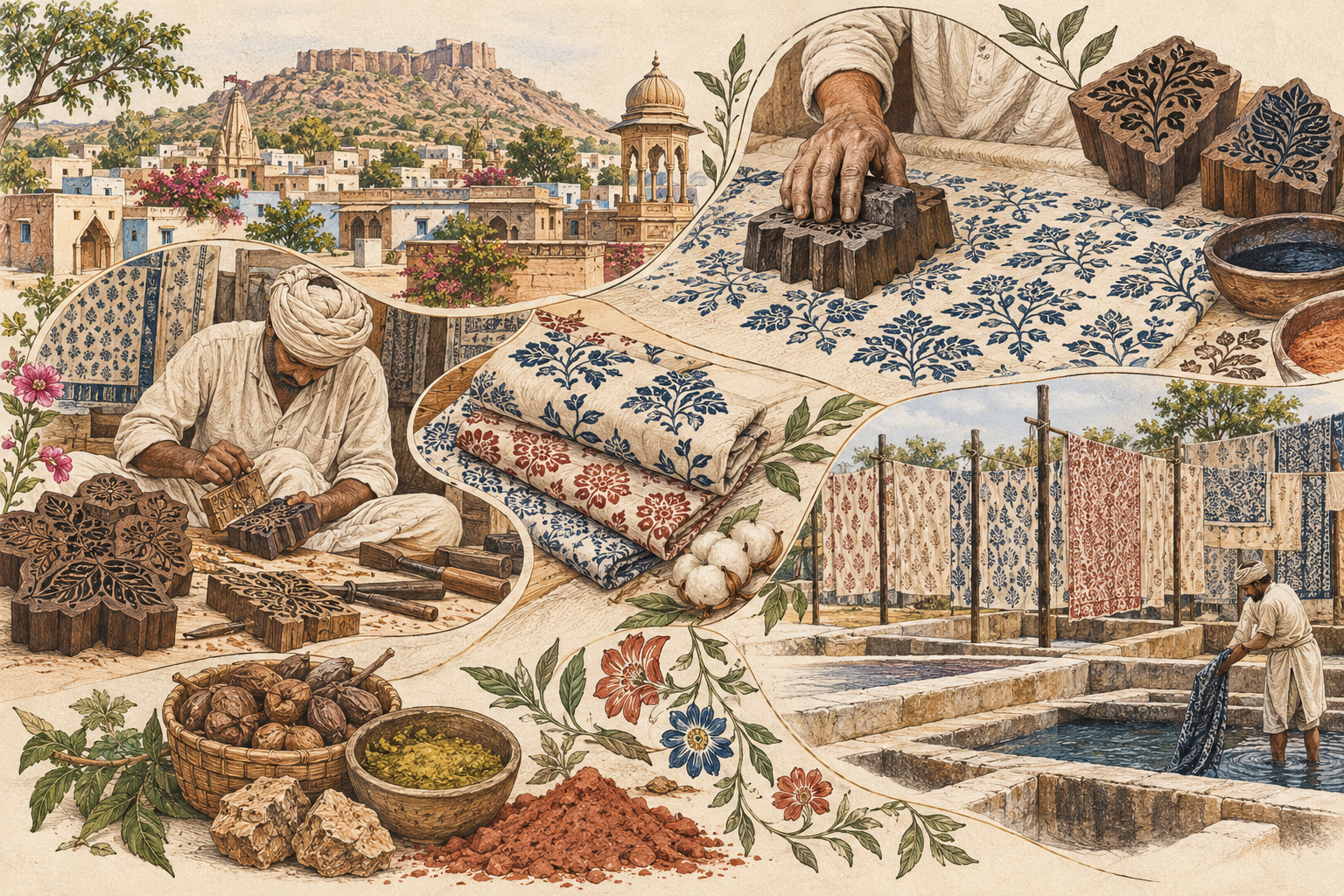
Bagru is a real place, a village roughly 30 kilometres from Jaipur, and the printing tradition takes its name directly from it. It’s part of why Jaipur is considered the capital of block printing, with several distinct printing centres, each with its own techniques, sitting within a fairly small radius of the city. That geography matters, because it ties the craft to a specific lineage rather than a generic technique anyone can claim.
The people who developed and sustained this craft are the Chhipa, sometimes spelled Chippa, a community whose name itself relates to the work of printing and dyeing cloth. Knowledge here has traditionally passed down within families and workshops, generation to generation, which is part of why the skill is so hard to shortcut or replicate at scale. Recognising this is recognising the people behind the fabric, not just the technique.
Bagru’s status as a Rajasthan GI (Geographical Indication) textile tradition formalises what artisans have known for a long time: that this printing style, tied to this place and this community, is distinct enough to deserve protection and recognition, in the same way GI status protects products like Champagne or Darjeeling tea. For B2B buyers, that’s a meaningful signal:
- Bagru isn’t a style descriptor floating free of its origins
- It refers to a technique tied to a specific place, community and skill set
- It fits into a much longer thread in the history of Indian textiles
The craft historically served local and regional needs rather than starting out as an export product. Colours and motifs weren’t purely decorative choices. In many traditional contexts, specific colours and patterns carried social or community meaning, connected to occasions, regional identity or the customs of the communities who wore them. That layer of meaning is often lost in how block printed textiles get marketed today, where the visual pattern is highlighted but the reason it looks the way it does gets dropped. Bringing that context back into the conversation is part of what separates a well-informed sourcing partner from one that’s just repeating “handmade” as a marketing word.
This distinction also matters commercially. A buyer who understands that Bagru refers to a specific technique, rather than a generic look, is better positioned to ask suppliers precise questions: which resist method was used, which dyes, how many blocks a design required. Those questions tend to surface whether a workshop is genuinely working within the tradition or applying a similar visual style through faster, less labour-intensive methods. Neither approach is inherently wrong for every use case, but they’re not interchangeable, and pricing should reflect which one a buyer is actually getting.
It’s also worth noting that Bagru is often mentioned alongside Sanganer, another Jaipur-area printing centre, and the two are sometimes confused or blended together in casual descriptions. We’ve written separately about how Sanganeri and Bagru prints actually differ, but the short version is that Bagru is specifically associated with the Dabu mud-resist method and its particular palette of natural dyes, which is a meaningful technical distinction worth making clear in product and content pages rather than letting the two run together.
Dabu: the mud-resist technique that isn’t a colour at all
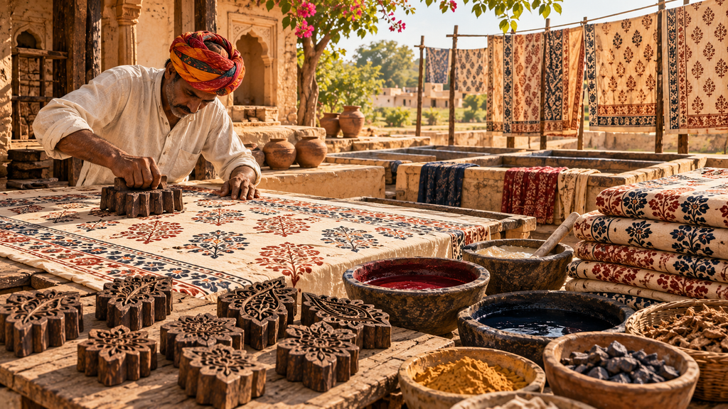
This is the part most people get wrong first. Dabu isn’t a shade in a colour chart. It’s a resist paste, applied by hand to the areas of fabric that need to stay unaffected by the next round of dye.
Once the paste is applied, the fabric goes into the dye bath. Wherever the paste sits, the dye can’t reach the cloth. When the resist is later washed away, what’s left underneath is either the original fabric colour or whatever colour was printed in an earlier stage, depending on how many rounds the piece has already been through.
The traditional paste itself is built from ingredients that sound closer to a recipe than a chemical formula:
- Mud collected from ponds, sieved to remove grit
- Lime, gum and wheat chaff mixed into the mud
- Sawdust dusted over the wet paste after printing, to help it dry and stop the dye bleeding through where it shouldn’t
This is a technique that rewards experience. Get the paste consistency wrong, or the drying time off, and the resist fails. A resist that cracks too early lets dye seep under the paste and blur the edge of a pattern. One that stays too wet can smear during handling, before it’s even reached the dye bath. Because the paste is a natural, hand-mixed material rather than a standardised product, its behaviour shifts with humidity, temperature and the exact composition of the mud, which is why experienced hands matter as much as the recipe itself.
This also has a direct bearing on how many colours a single piece of fabric can carry. Multi-coloured Bagru designs are often built through repeated rounds of resist and dye, layering one protected area over another across several passes. Each round adds production time and depends on the resist from the previous round holding cleanly, so a piece with several distinct resisted colours represents meaningfully more work than a two-tone design, even if the visual difference isn’t obvious to someone unfamiliar with the process.
For buyers, this is worth flagging explicitly in product descriptions and sourcing conversations. A design with sharp, clean resist lines took real skill to produce.
Why the fabric prep stage matters more than people assume
Before a single block touches the cloth, the fabric itself has to be prepared, and this stage is more involved than a simple wash cycle. It’s covered in more depth in our breakdown of how hand block print fabric is made, but the short version includes:
- Soaking raw grey fabric to strip out starch and other impurities left from weaving and finishing
- Extended washing and beating the cloth, depending on the process
- Traditional treatments using materials like harda, castor oil and soda ash
The reason this stage exists isn’t tradition for its own sake. Dye and resist paste need a clean, evenly absorbent surface to behave predictably, which is also why choosing the right base cloth matters; we go into this in our guide to natural fabrics from India for block printing. Skip or rush this step and the same block, the same dye and the same artisan will produce inconsistent results.
The harda treatment specifically deserves a mention here, since it does more than clean the fabric. It’s a preparatory step that helps the cloth accept natural dyes more evenly and can influence the base tone the fabric starts from before any colour is applied. Because natural dyes bond with fibre differently than synthetic ones, fabric that hasn’t been properly prepared can show patchy or uneven colour uptake later in the process, a problem that’s much harder to fix after printing than to prevent beforehand. This is one of the quieter reasons handmade Bagru textiles can take longer to produce than buyers sometimes expect, and it’s a useful thing to explain to clients who ask about turnaround times or ask why two visually similar orders come with different lead times.
Where the colours actually come from
Bagru’s palette is built from natural materials, not a standard synthetic colour library, and each colour has its own process:
| Colour | Traditional source |
| Black | Iron filings or iron-based material, combined with jaggery and gum |
| Red | Madder (alizarin) processed with alum |
| Blue/indigo | Natural indigo |
| Yellow | Harda and other natural materials |
| Brown/grey/khaki | Kashish-based preparations |
| Green | Achieved by layering combinations of the natural colours above |
Red is a particularly good example to highlight in buyer-facing content, because the colour doesn’t appear instantly. The alizarin and alum interact with the fabric over the course of the treatment, and the shade visibly develops and deepens as the process continues rather than showing up as a flat, single application.
This gradual development is a useful thing to set expectations around with buyers who are used to synthetic dyeing, where colour is usually immediate and highly consistent batch to batch. Natural dye colour depends on the exact mineral or plant material used, the water, the timing and the artisan’s judgment of when a shade is “done.” That means very slight variation between production runs is normal and, for many B2B buyers in the sustainable and artisan space, part of the appeal rather than a flaw. It’s worth being upfront about this rather than letting a client discover it as an unexplained inconsistency.
Green is also worth calling out specifically, since it isn’t a single natural source but a combination, typically built by layering a yellow and a blue application. That layering approach is a good example of how the natural dye palette, despite being more limited than a synthetic colour chart, still produces a wide working range through combination rather than a fixed list of standalone colours.
Indigo dyeing is a living process, not a dip in blue liquid
It’s tempting to describe indigo dyeing as simply putting fabric into blue dye, but that undersells what’s actually happening. Indigo doesn’t work like a standard dye. Fabric goes into the vat looking almost unchanged, and it’s only after it’s pulled out and exposed to air that the oxidation reaction produces the familiar deep blue.
Traditional indigo vats are often kept underground and maintained using indigo, lime and pomegranate-related material, with an experienced artisan monitoring the vat’s condition over time, since a vat can go “off” if it isn’t managed correctly. This is genuinely one of the more compelling stories in the whole craft, and it’s worth giving it real space in content rather than compressing it into a single sentence. Buyers and design-conscious audiences respond well to understanding that a vat is closer to a living culture than a static dye bath.
The practical consequence of this is that indigo dyeing isn’t something that can be scaled up simply by adding more vats overnight. A vat represents an ongoing relationship between the artisan and the material, built up and maintained over time, and a poorly kept vat can affect every piece dyed in it. That’s part of why continuity of the same skilled hands matters in this stage specifically, more so than in some of the other steps in the process. For buyers, it’s a good talking point for explaining why indigo pieces from an established workshop carry a level of consistency that’s hard to replicate from a newly set-up operation, whatever the raw materials used.
One design, multiple hand-carved blocks
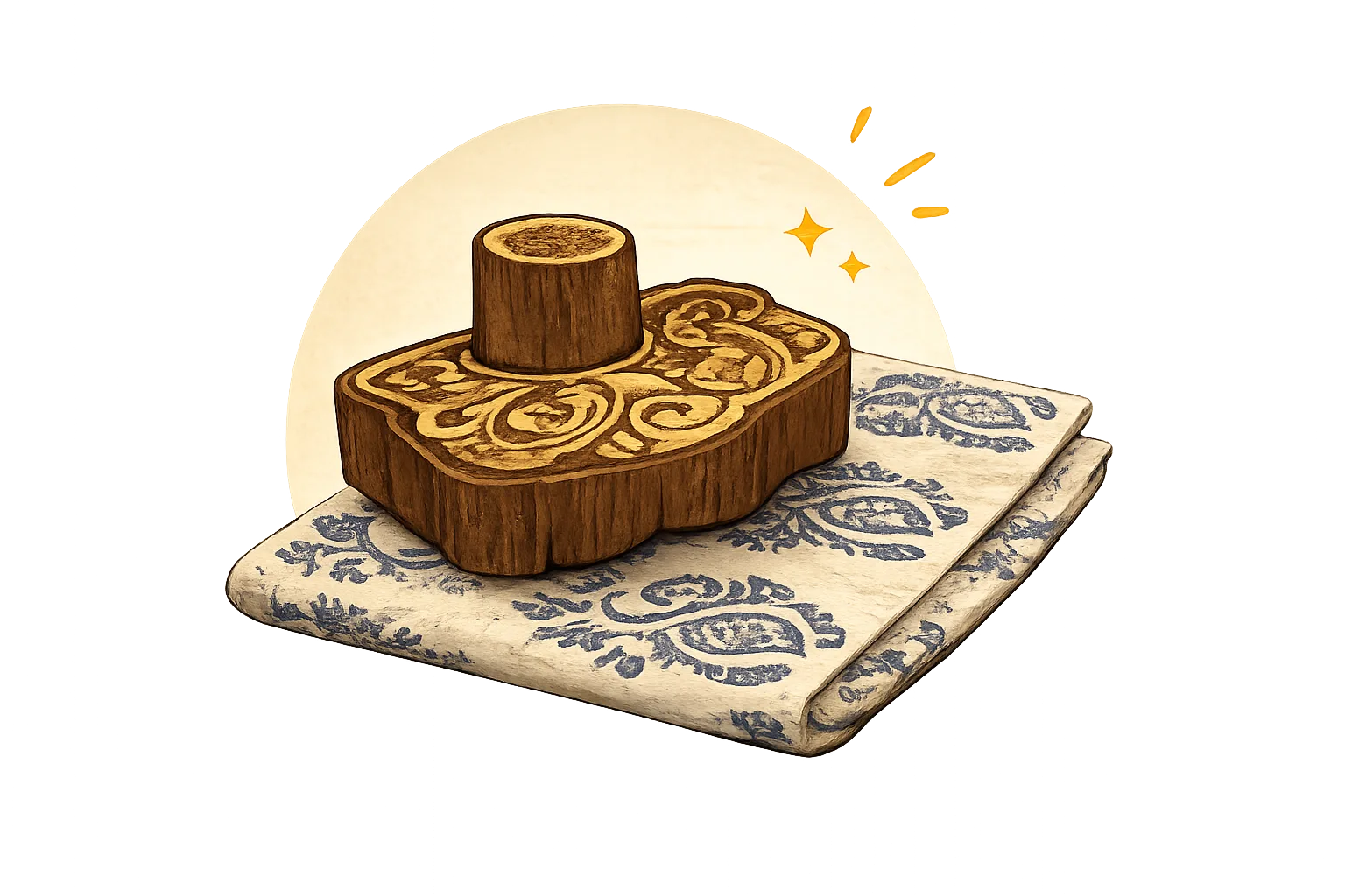
Every motif starts with a block, hand-carved from sheesham wood. What’s less obvious to people outside the trade is that a single design is rarely produced from just one block. Outlines, background fills and fine details are often carved onto separate blocks and printed in sequence, each one aligned by hand.
This is a useful point to make explicit in product or process pages, because it explains both the visual depth of complex Bagru patterns and why more intricate designs take longer and cost more. It’s not decoration for its own sake. It’s a direct reflection of how many separate printing passes went into the fabric.
Each additional block also adds a point where alignment can go slightly off, since every block has to be positioned by eye and by hand relative to the ones printed before it. A design that looks crisp and precisely registered across several colours and layers is, in effect, a record of an artisan’s accuracy across every single repeat of the pattern down the length of the fabric. This is one of the more visible ways a buyer can judge the quality of hand block work directly: consistent alignment across a long fabric run is a meaningful indicator of skill, not just a cosmetic detail.
The motifs and palette that define the look
Bagru’s visual identity comes from a recognisable set of motifs:
- Gainda (marigold)
- Gulab (rose)
- Kamal (lotus)
- Bel (vine)
- Buti and buta patterns (small and larger repeating floral or paisley-style motifs)
These sit within a palette of deep red, indigo, iron black, yellow, green and earthy neutral tones. Understanding the motifs by name, rather than just describing them generically as “floral patterns,” gives buyers and design partners a shared vocabulary when discussing custom orders or matching an existing collection. It also makes it easier to communicate scale and placement clearly: a small buti repeated densely across a fabric reads very differently from a larger buta used as a focal motif, and naming that distinction upfront avoids miscommunication during custom design conversations.
If you’re weighing this against other regional crafts, it’s worth comparing it to something like Kalamkari, which relies on hand-painting or a different printing logic entirely rather than the resist-and-block method described here.
Sourcing Bagru textiles for your brand
For boutique owners, sustainable fashion brands and sourcing agents building a collection around this craft, understanding the process above isn’t just background reading. It shapes realistic expectations around:
- Lead times, since every stage described here is manual and skill-dependent rather than automated
- Minimum order quantities and how they connect to production capacity
- Pricing differences between simple and multi-block designs
If you’re exploring ethical sourcing from India or want to see how this fits into a broader sustainable fashion strategy, those pieces go further into what to ask suppliers and how to structure a first order. For direct wholesale enquiries, our wholesale page has MOQ and process details.
Conclusion
Bagru hand block printing holds up under close inspection precisely because nothing about it is generic. The Dabu resist paste, the fabric prep, the natural dye sources, the maintained indigo vat and the multiple hand-carved blocks behind a single motif all point to the same thing: this is a craft built on inherited skill, not a template that can be replicated overnight.
For boutique owners, sustainable fashion brands and sourcing partners, that context is practical, not just interesting background. It explains lead times, why pricing varies between designs, and what questions are worth asking a supplier before placing an order. Understanding the process is really the first step in sourcing it well.
If you’re exploring a wholesale collection built around Bagru or Dabu printing, our wholesale page is the best place to start the conversation.